The Poker Bank New Website Design
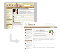 Finally. The new ThePokerBank design is all sorted and ready for everyone to enjoy. It took me long enough!
This quick guide will highlight the biggest changes and help you to find your feet across the new site. There will also be a little bit of information on why I made the change.
What's new about ThePokerBank?
These are the biggest changes that you will notice about the site:
- Faster loading times. The site is more fun to surf around.
- A new rakeback section.
- A better navigation system. I'm hoping that stuff will be easier to track down and find for you.
- The Texas Hold'em strategy articles have a better structural layout. Easier to read and learn from.
- Many articles have been revamped or rewritten.
- A big ass Texas Hold'em FAQ. Enjoy.
- A search feature that actually works (thanks to help from Google).
- An about me page. I guess nobody had a clue who I was before.
I think that those are the most noticeable and useful changes that you will find as you browse around.
There is also text like this floating around this site. This basically means that it's important information.
There's lots of other shiz too, but those are the biggest changes. Oh and also...
- Click me or die.
-
This is a toggle box / pop-open box / whatever you want to call it. Just click on the header to open them up and click on the header again to close them. These help to reduce the length of the pages where possible.
You wouldn't have died if you didn't click on the header by the way. This is a friendly site.
Why the change?
There were many, many reasons for the new design. I'll list 3 of the big ones:
- The old site was slow was hard to develop. With this site it's easier to add more pages and stuff.
- The old site was getting on a bit in the looks department. It looks sleeker now (I'd say so anyway).
- There was no rakeback section! I really wanted to offer rakeback to players, so I thought a new design was the perfect opportunity to start doing so.
I'm sure that many of you will have gotten used to the old design and liked it the way it was. I apologize to those of you that enjoyed the old design, but I'm confident that you will grow to like this one a lot more.
About the change.
The redesign started in a "spur of the moment" moment at the beginning of March 2009. I was tired of the old design and really wanted to develop the site, so a new design was in order.
Getting a new website design and logo was the easy part; that was all sorted by mid March. The hard part was transferring all of the articles over on to the new site. In addition to this, as I was transferring all of the pages over, I started to notice that the articles could be vastly improved. Therefore, as the content was being moved over I was rewriting and restructuring almost every single page as I went along.
4 months later (30th of June 2009) and it's all "done". I've still got a lot of stuff planned for the site, but now it is all ready for you to enjoy. It's been one hell of a project, but it has definitely all been worth it.
Help me make this site better.
As much as I might like to think it, I am not perfect.
There may be a few minor problems or mistakes floating around the site, so I would greatly appreciate it if you could contact me and let me know about them so I can get them fixed.
Alternatively, if you have any suggestions on how the site can be improved in any way at all, I am all ears. Either way, this site will only get better with YOUR feedback, so please let me know your thoughts if you have any. I read all emails and reply to your feedback.
All the best, and enjoy the new design.
Greg.
Go back to the about me page.